A website project becomes expensive when basic decisions stay vague, though you do not need a perfect brief on day one. Scayver Graphix plans, designs, builds, and supports connected digital work, and these guides are meant to help you make a sharper decision, whether you work with us or another team.
Start website planning decisions with what is actually wrong.
If your site feels dated, do not assume you need to rebuild it. Compare redesigning with improving the current site. A weak offer, unclear copy, broken form, slow page, and outdated visual system call for different work. Then make a website page inventory and prioritize the page backlog. That keeps a visually appealing but low-impact page from consuming the attention the primary journey needs.
Use website scope boundaries to separate the deliverables you are buying from dependencies and operating work around them. If you are considering a compact site, weigh one page against multiple pages by visitor tasks rather than by an arbitrary page count. Choose a primary website conversion so every proposed page has a reason to exist.
Make the structure understandable.
Visitors use their own words, not your internal department names. Review navigation labels, how to organize service pages, and when to merge competing pages. Give important information an identifiable owner with a website content ownership map. A navigation sketch and a responsibility map often reveal problems before design begins.
What would a first-time visitor try to find in the first minute, and could they find it without your explanation? That question is more useful than asking whether the menu looks modern.
Shape the design around the job.
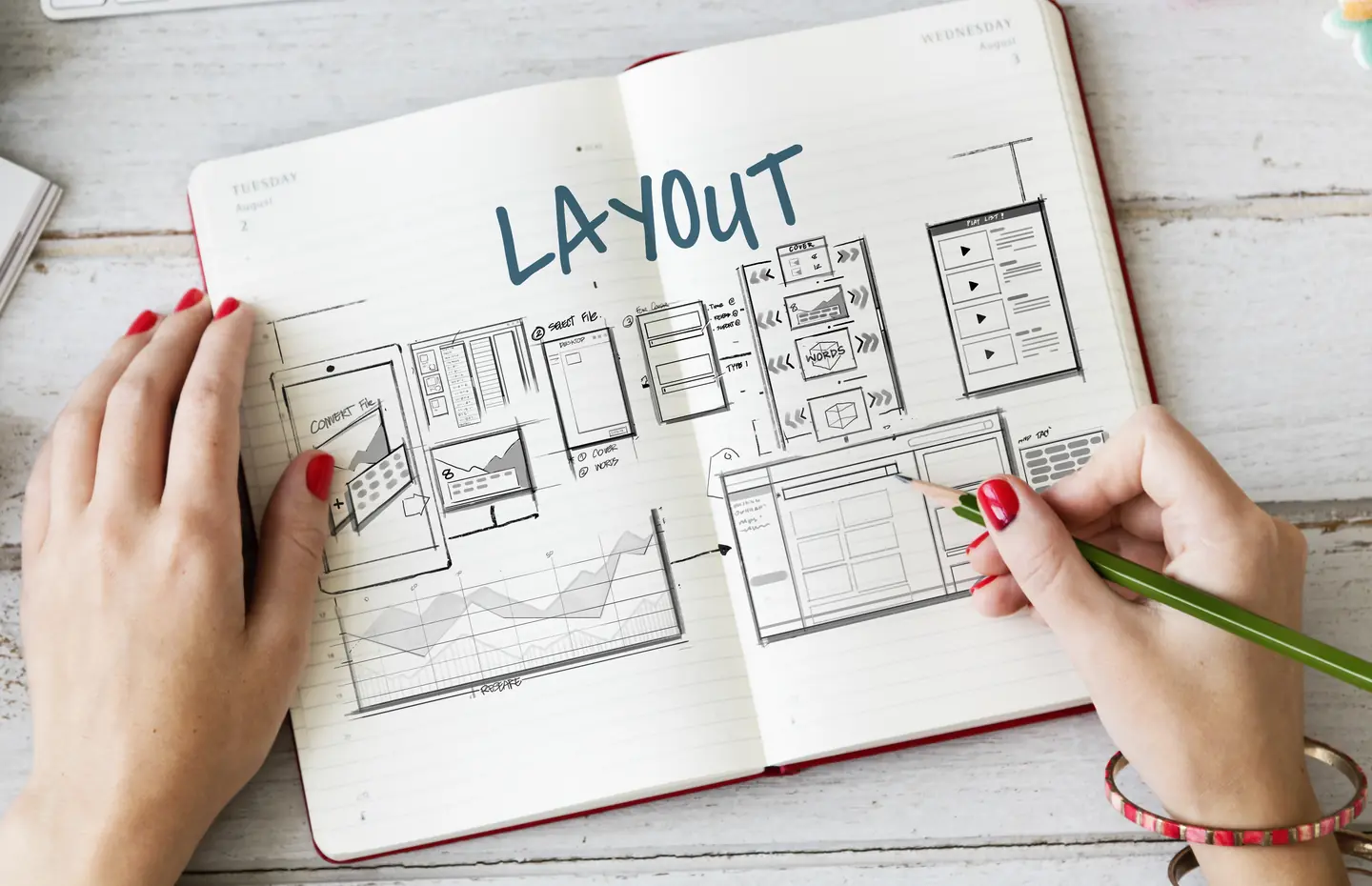
Wireframes test the order of information before colors and imagery create attachment to a direction. Then choose a visual direction and translate the brand system into website decisions. Use homepage review criteria and page visual hierarchy to judge whether visitors can follow the story, not just whether the mockup looks polished.
Small screens expose unclear priorities. Review mobile navigation and responsive content priorities separately. Plan accessibility within the redesign scope, image purpose and rights, and typography for real reading before a prototype turns those choices into expensive rework.
Help the right visitor take the next step.
Choose contact form fields that collect enough information without demanding a full brief from a stranger. Plan the contact page around the actual response process. Make service pages answer buyer questions and give the homepage a message sequence that moves from recognition to action. A sitewide CTA hierarchy helps visitors understand their options without seeing competing buttons on every screen.
If you lack permission to use client results, build trust without testimonials by making the scope, process, ownership, and limits clear. Evidence should show what you can substantiate, not what a layout leaves room for.
Review a real proposal and prototype.
Use motion decisions to keep interaction useful and accessible. Compare reusable templates and custom pages against your content model. Set design acceptance criteria before signoff, then run a stakeholder prototype review with tasks and recorded findings.
The most useful output from these guides is not a collection of opinions. It is a short decision record: what matters, why, who owns it, what evidence will settle it, and what comes next. If you want help turning that record into a connected website plan, explore web design or talk to a specialist.