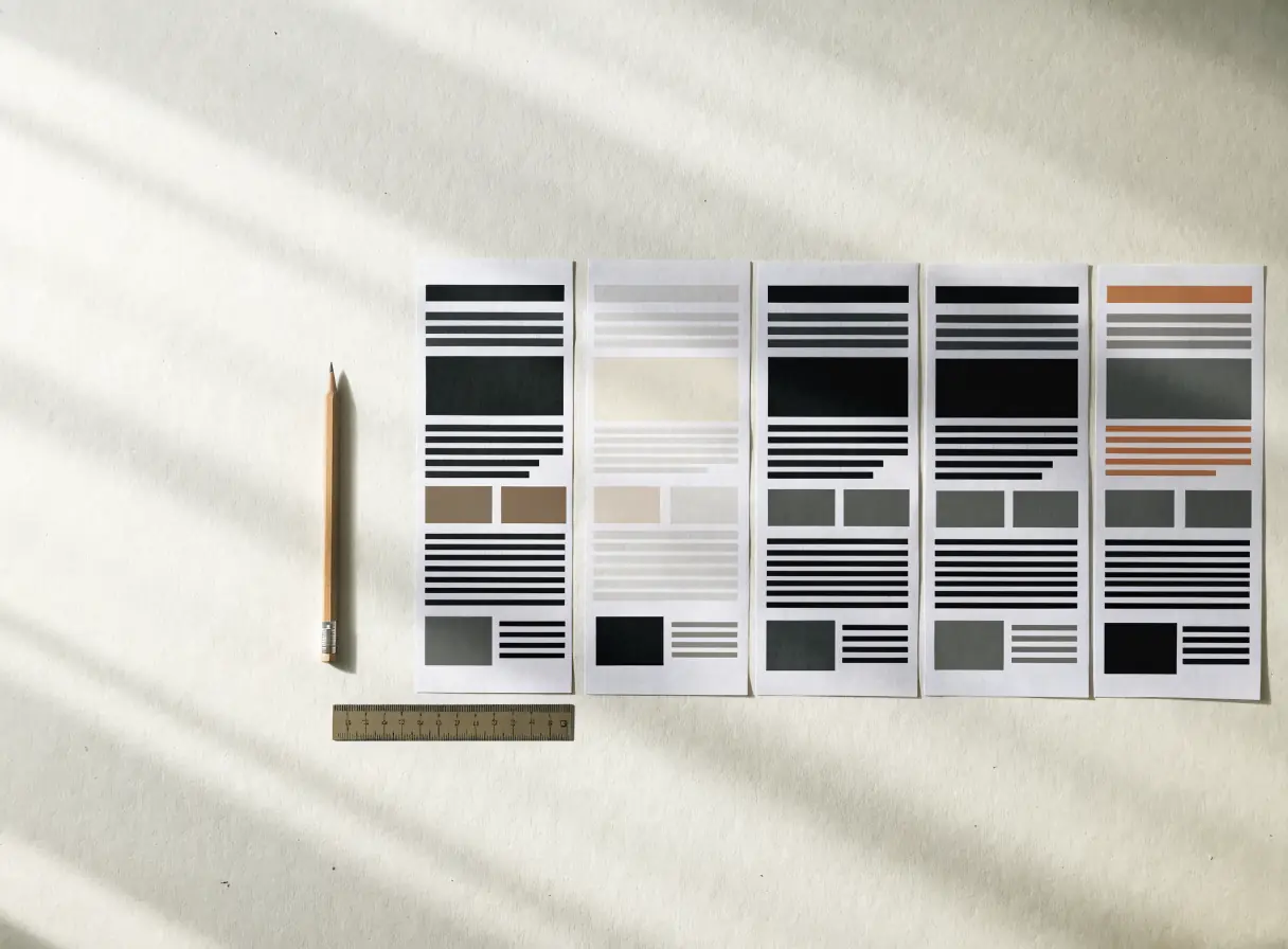
Rank the information before styling it.
A larger heading alone cannot fix a page where every block competes for attention. Start by deciding which question the page answers and what information the reader needs before taking action.
Write a one-sentence purpose for the page. Then list the facts a visitor must understand, in order. A service page may need the service definition, who it fits, what the work includes, what the client supplies, and the next step. A contact page may need the right route, expected response, and a usable form. Different page jobs require different emphasis.
Mark one dominant message per section. If a section tries to sell three benefits, explain a process, and show six related links, split it or choose a clearer focus. The reader should be able to scan the heading and grasp why the section exists.
Use design elements for meaning.
Size can signal importance. Spacing can separate decisions. Alignment can show relationships. Color can distinguish actions and categories. None of these should carry essential meaning alone. A primary action should be clear from its wording, position, and treatment. A warning or error needs text as well as color. An image should explain or support an idea rather than fill an empty region.
Check the page without its decorative media. Does the content order still make sense? If not, the hierarchy may rely on visual effect instead of a sound argument. Then restore the media and check whether it clarifies rather than distracts.
Test scanning and close reading.
Ask someone to scan the page for ten seconds and tell you what it offers. Then give them a concrete task, such as finding what is included or reaching the right contact path. Observe whether they use headings and labels as expected. A page can pass the quick scan while hiding crucial details in low-contrast captions. It can also contain every detail but offer no clear entry point.
Review narrow screens, long text, zoom, and translated or expanded labels where relevant. A neat desktop composition may collapse into a sequence that places the CTA before the explanation it needs. Hierarchy must survive reflow. Test a realistic error or empty state if the page contains a form or dynamic content.
Keep emphasis scarce.
When every sentence is bold, nothing stands out. When every section has a colored background, color stops helping the reader understand relationships. Use high emphasis for the central message and primary action. Use quieter patterns for supporting detail. A page can be visually rich without making every block compete for first place.
Which part would a first-time visitor miss if they scanned only headings and buttons? If it is essential to a decision, change the structure rather than simply adding another decorative highlight.
Review a real page.
Bring one page, its visitor task, and realistic content to a review. UI/UX design can shape the hierarchy and interactions. Talk to a Specialist if the page is attractive but visitors still struggle to find the answer.