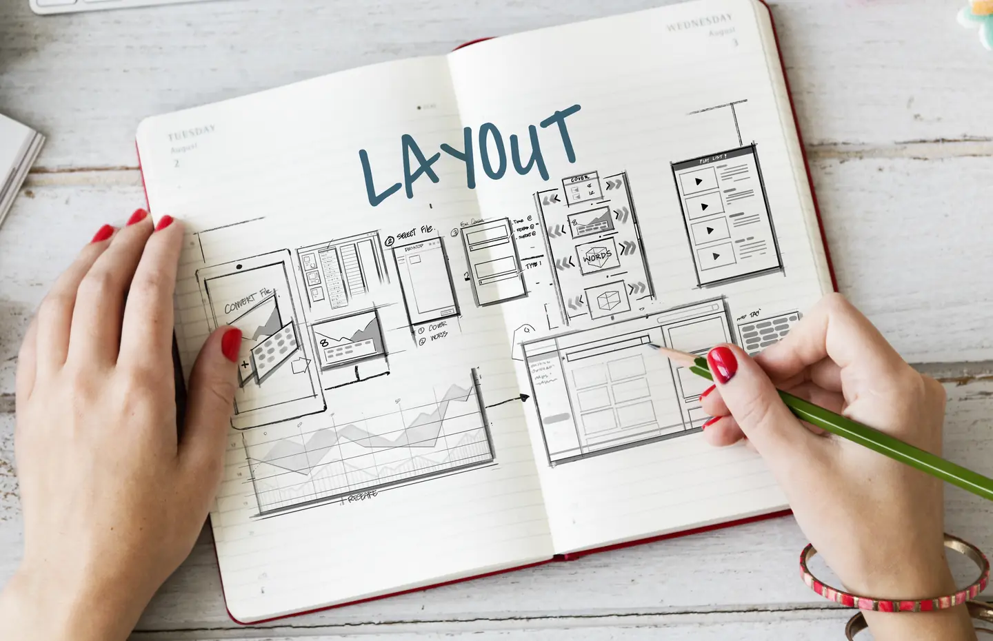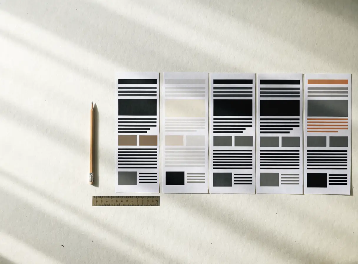
Define the intended response.
A mood board can begin the conversation, and the direction should also hold up through future updates. “We like this look” is useful feedback. It becomes stronger when you can say what the look helps a visitor notice or do.
Write a short sentence describing how the visitor should feel after the first screen and why. A complex technical service may need to feel understandable and accountable. A creative product may need room for distinctive work. A local professional service may need immediate clarity about availability and next steps. Avoid asking for several incompatible moods at once. If every adjective matters equally, none will guide a design decision.
Connect the response to a page task. Does the visual system need to support close reading, product comparison, appointment booking, or project evidence? The task affects spacing, typography, imagery, and interaction. A direction that looks dramatic in a single mockup may become tiring across dozens of content-heavy pages.
Compare references by useful parts.
Collect examples of typography, image treatment, navigation, page rhythm, and proof presentation separately. Note what each example does well and what would not fit your business. A competitor’s entire site is not a brief. Borrowing a surface style without its content or audience context can produce an attractive mismatch.
Use real material in the comparison. Put one of your actual service explanations, a long heading, a weak image, and a form into the proposed design. If the direction relies on unusually short copy or polished photography you do not own, it may not be sustainable. A visual direction should support the content you can maintain.
Set a few firm rules.
Agree on type roles, color roles, image criteria, content width, spacing rhythm, and interaction restraint. Identify what must stay legible in dark and light contexts. Name patterns you will not use if they obscure meaning, such as decorative motion around a form or repeated cards that make every service look interchangeable.
Do not treat those rules as a substitute for page-specific composition. The same system can support an overview, service page, article, and portfolio record while giving each a distinct communication job. A successful direction is flexible enough for the full site and specific enough to feel like your brand.
Review a website visual direction with decision criteria.
Ask reviewers to judge whether the proposed direction clarifies hierarchy, supports trust, handles real content, works on a phone, and remains usable with keyboard and zoom. Gather disagreements around those criteria. “I prefer blue” is a preference. “The secondary action has the same emphasis as the primary action” is a testable design concern.
What would make you reject a beautiful concept? Decide that before the concept arrives. It protects the project from approving a style that does not support the job.
Bring a brief, real content, and references.
Bring a focused brief, real content sample, approved assets, and two or three references with notes. Web design can turn that material into a coherent direction. Talk to a Specialist if you need help choosing criteria before reviewing concepts.