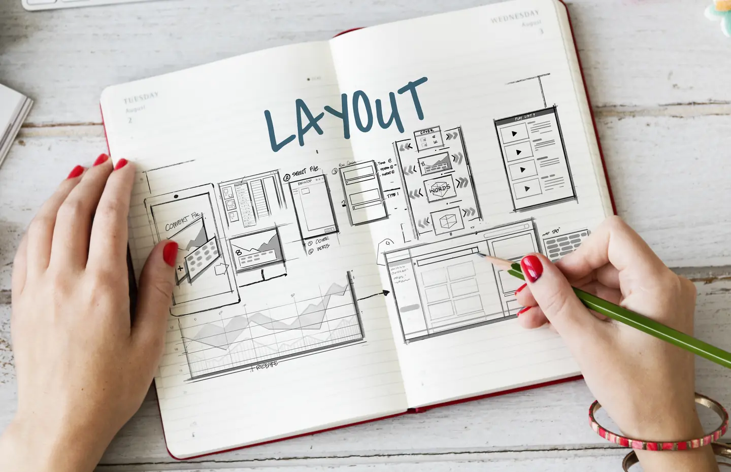
Identify the page’s decision sequence.
Responsive design is not only about shrinking columns. It changes the order and proximity of text, media, controls, and supporting details, so a page that works on desktop can lose meaning when related pieces stack on a phone.
Write the question the page answers, then list the information needed to answer it. On a service page, the visitor may need to understand the problem, what the service covers, who it fits, and how to discuss a project. On a portfolio page, context should accompany the work sample. On a contact page, the right route and expectation should appear before a long form.
Place essential content early in the reading order. Do not hide the core answer in a carousel, tab, or collapsed panel simply to keep the first screen short. Collapsible sections can organize supporting detail, but they should not make the page’s purpose invisible.
Review responsive content priorities when the layout stacks.
Check whether a visual that sits next to a paragraph on desktop lands several screens away on mobile. If the image carries meaning, keep it near the relevant explanation. If it is decorative, it should not delay the answer. Review comparison tables, paired cards, process diagrams, and sidebars individually. A two-column design cannot always become one long column without editorial decisions.
Decide whether a table should scroll, become a labeled list, or split into focused comparisons. Preserve labels and relationships. Avoid turning a comparison into a series of isolated numbers without context. A responsive rule is successful when people can still use the information, not merely when nothing overflows.
Keep actions connected to context.
A CTA can move on mobile, but its promise should still follow the information that makes it sensible. An inquiry button before any service explanation may ask too early. A form after twenty screens of loosely related content may ask too late. Test the sequence with a real task rather than assuming every page needs the same sticky action.
Give controls enough room to operate. Keep error messages near fields. Make menu and filter states visible. Long headings and button labels are useful stress tests because actual content rarely stays as tidy as a design placeholder.
Compare real devices and content extremes.
Use a narrow phone, a larger phone, and a wide screen. Zoom the page. Try a long FAQ answer, missing media, and a service title that wraps. Check reading order with a keyboard. A screenshot can show appearance, but it cannot prove that focus or form behavior makes sense.
What information would you remove on mobile, and why would a mobile visitor need it less? If you cannot defend that answer, adapt the presentation instead of deleting the information.
Plan the page with its content.
Bring the actual copy and media to UI/UX design rather than asking the design to survive content added later. Talk to a Specialist if your current site is technically responsive but hard to understand on a phone.