


A website’s real test starts after launch. Can your team update a service without disturbing the layout? Can you publish a case study without copying an old page and repairing it? Can a visitor understand what you do, see relevant work, and find a clear next step?
Those three questions shaped the Scayver Graphix website rebuild. We wanted a site that explains our work more clearly and is easier to manage, so we looked past individual pages to the structure that connects content, design, and publishing.
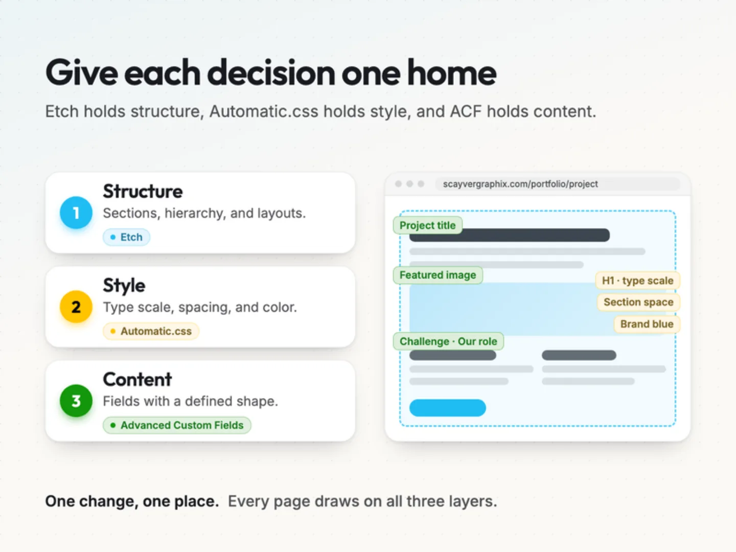
Our own website should meet the standard we bring to client work: thoughtful design, clear information, and a foundation that supports the next update. We chose three tools because each one owns a different part of that foundation. Etch handles structure, Automatic.css handles style, and Advanced Custom Fields handles content.
Why does website maintenance get harder over time?
Most websites don’t become hard to manage overnight. The friction builds through small decisions.
One page gets custom spacing. Another uses a slightly different heading size. A new service needs a layout change, so someone duplicates an existing page and edits it. The next person copies that version.
Eventually the site holds several interpretations of the same design.
Content gets tangled with presentation, too. When a case study is a set of manually arranged text boxes and images, publishing the next project means assembling another page. The editor has to manage the story and the layout at the same time, then check spacing, buttons, image proportions, and mobile behavior all over again.
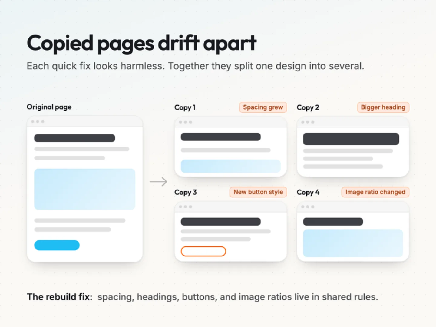
For our rebuild, we wanted every shared decision to have one clear home:
- A typography change happens in the design rules.
- A change to a project description happens in its content.
- A change to how case studies display happens in their template.
That separation became the central principle of the rebuild.
Start with what visitors need.
Before choosing how to build the site, we looked at what people need from it.
A prospective client should be able to understand our services, find work relevant to their situation, and decide whether to start a conversation. Every page should help with one of those steps.
Someone planning a website redesign might want to understand our approach first. Then they may open a project to see what Scayver Graphix actually contributed. Once they have enough context, they need a straightforward way to talk about their own site.
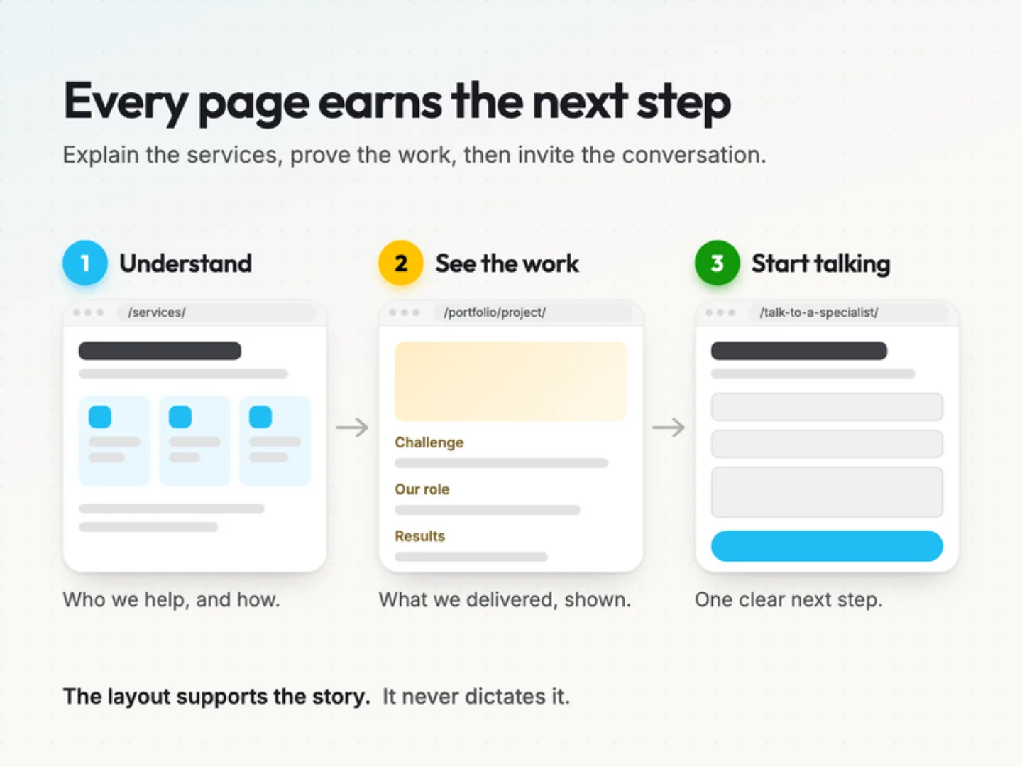
Services, project stories, and contact paths should support that sequence. The same thinking applies to publishing. If a case study helps someone evaluate our work, its editing structure should prompt us to explain the challenge, our contribution, and the evidence available. The layout supports those answers instead of dictating the story.
The tools behind the rebuild.
Our stack gives structure, style, and content separate responsibilities.
| Tool | What it owns in our approach |
|---|---|
| Etch | Page structure and reusable layouts. |
| Automatic.css (ACSS) | Shared typography, spacing, color, and responsive rules. |
| Advanced Custom Fields (ACF) | Repeatable content with a defined shape, ready for templates. |
The value comes from using them together. Each tool gives us one place to manage decisions that would otherwise scatter across individual pages.
Etch: deliberate page structure.
We wanted the convenience of visual development without losing control of the structure behind a page.
Etch is a visual development environment for WordPress. In our approach, it builds and maintains the layouts that present our content.
That structure matters. Headings set the hierarchy. Lists group related information. Sections organize the page around meaningful ideas. We make those choices deliberately and keep the resulting layouts readable, so when a page needs a different hierarchy, we can revise it without guessing how it was assembled.
Automatic.css: shared design decisions.
A service page and a portfolio page serve different purposes. They can have different compositions and still clearly belong to the same website.
Automatic.css provides shared variables, typography scales, and spacing rules for consistent styling.
Take section spacing. If every page uses unrelated values, a sitewide adjustment becomes a page-by-page task. Shared rules give us one place to make the change, followed by a review of the affected layouts. Typography works the same way. Related headings keep a consistent relationship, including when text wraps on smaller screens.
With those recurring decisions handled, we can spend our attention on the choices specific to each page: what deserves emphasis, how much information a visitor needs, and where the next action belongs. Our guide on turning a brand into a website system covers this in more depth.
Advanced Custom Fields: content with a defined shape.
The person publishing a project should be able to concentrate on explaining the project.
Advanced Custom Fields lets us define content fields in WordPress and use their values in templates. For a case study, that means dedicated places for the project summary, the challenge, the services delivered, approved media, and supported results. The template decides how that information appears.
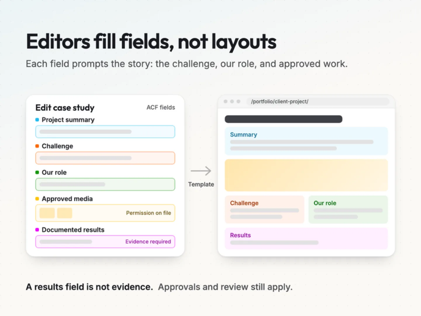
Editors get a clearer task. They can improve the copy or add project details without rebuilding the presentation.
The fields also act as editorial prompts. A field for the challenge reminds us to explain why the work was needed. A field for our contribution reminds us to describe what we actually delivered.
The content still needs judgment. A results field doesn’t establish evidence, and an image field doesn’t establish permission to publish. Accuracy, approvals, and review stay part of the process.
Where does each update belong?
The everyday benefit is knowing where a change belongs before anyone touches the site.
- If one case study needs a stronger explanation, we revise its content.
- If every case study needs a better presentation of deliverables, we revise the shared page template.
- If headings need a visual adjustment across the site, we revise the shared styling rules.
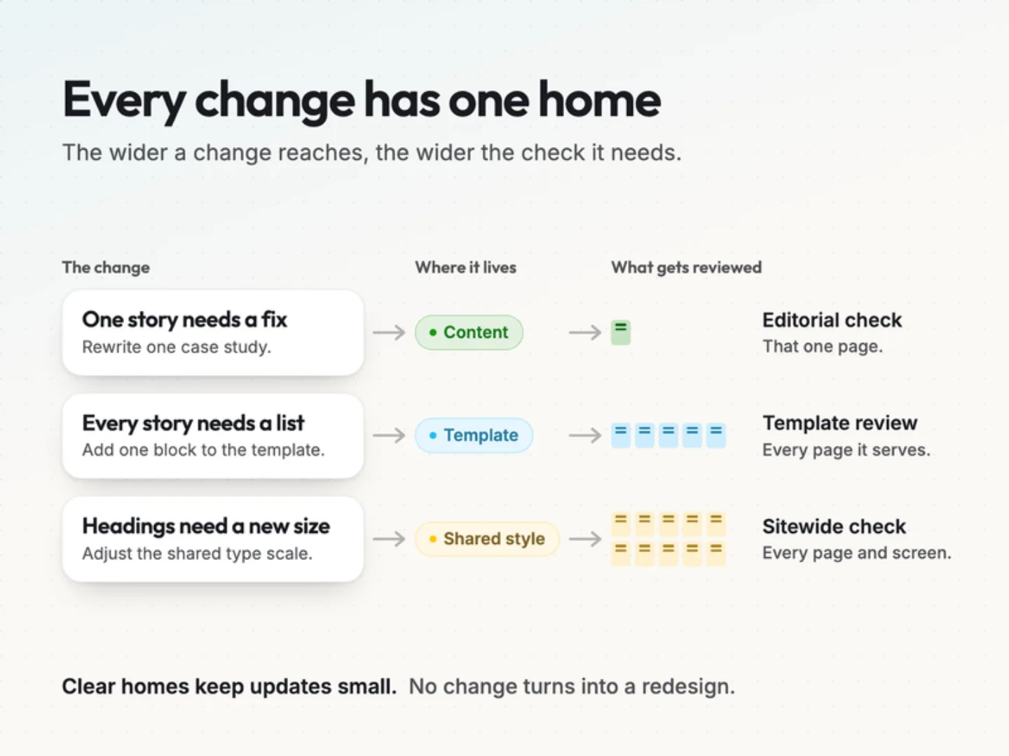
Those are different tasks with different reviews. A content change needs an editorial check. A template change needs a review across the content it serves. A shared styling change needs a broader visual check.
Keeping those responsibilities clear stops every update from turning into a small redesign. It also gives the next person maintaining the site an understandable starting point. They can find where a decision lives and see what depends on it.
Make case studies explain the work.
A portfolio image can attract attention. A useful case study explains what the reader is looking at.
It should establish the client’s challenge, describe our role, show the work, and separate documented results from intended outcomes. Without that context, visitors have to guess. They may see a polished website without knowing whether we handled the strategy, design, development, or only one part of the project.
A structured publishing process helps us collect those details before building the page. A shared template helps readers find them in the same place every time. Each story still gets the space it needs. Some projects call for a detailed look at the business problem. Others are best understood through the design decisions or the build itself. You can see how that plays out across our portfolio.
Performance and accessibility still need testing.
Better performance was one of our reasons for rebuilding. But choosing a stack doesn’t prove a website is fast.
Images, fonts, scripts, hosting, caching, and page content all affect the experience, and any speed claim needs a measurement under stated conditions. Our goal is to keep the build understandable, so we can see what a page loads and fix real delays. A performance budget helps decide where that page weight should go.
Accessibility takes the same discipline. Good structure supports it, but the finished site still needs checks for keyboard navigation, focus visibility, contrast, form feedback, and behavior across screen sizes. It also has to hold up every time someone publishes, which is why we treat accessibility as part of content operations.
Tool choices explain our approach. Testing proves the result.
What should you check before your own website rebuild?
If you’re planning a rebuild, look closely at what happens after a page goes live.
Ask your team to walk through a routine update. Publish a project. Change a service description. Replace an image. Follow the work from the first edit through review. That walk-through shows where the website creates unnecessary effort.
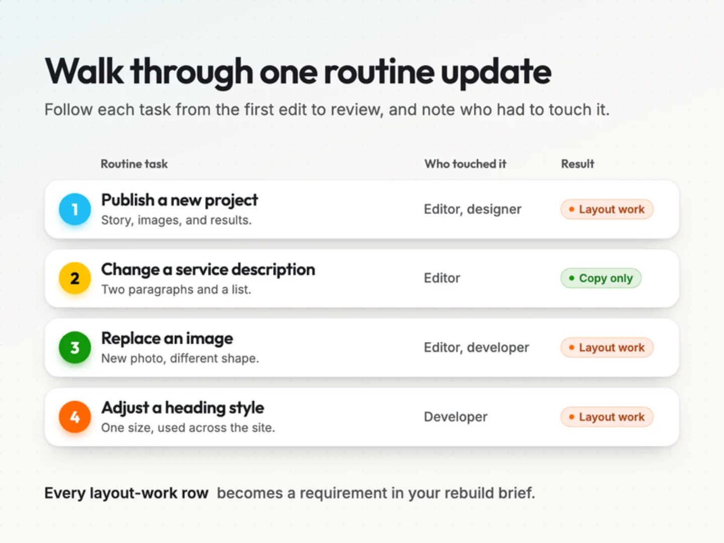
Useful questions include:
- Can an editor update copy without adjusting the layout?
- Do recurring pages use shared templates?
- Where do typography, spacing, and button styles live?
- What has to be checked when a shared design rule changes?
- Does the publishing process prompt your team to collect the information readers need?
These questions shape the rebuild brief. They turn “we need a better website” into concrete requirements for how the site should work. Our website requirements checklist and content migration inventory are good next reads.
Build for the next update.
The rebuild gave us a chance to rethink how our website serves visitors and the people who maintain it.
Etch, Automatic.css, and ACF give structure, style, and content their own homes. That gives us a foundation we can refine as our services and project stories grow.
The next update matters because it tests every decision made during the rebuild. A new project should fit a considered publishing process. A design adjustment should have a clear source. A visitor’s question should help us improve the content.
If your website makes routine updates harder than they should be, bring that problem into the rebuild conversation. Explore our web development approach, then talk to a specialist about the update your current site makes difficult.
Was this article helpful?
